There’s something very common between a barbershop and web design. You find it extremely difficult to explain which haircut exactly you need, and these are the feelings which are very similar to the ones your customers have when trying to explain what website they need. Not surprisingly – they have never faced web design, they don’t know how it is done and they can’t even explain what they need. Until they see it. Which is why, to keep your nerve calm and your time saved, you may use ready-made templates. Luckily, the designs offered in these templates are of high quality, and this makes the choice easier. You may need a design with or without a Parallax effect, for a housewife blog or for a huge retail store, in dark or in light colors… Regardless of what you need, you will find them. If you spend some time, you may find literally everything that you need.
If at the moment, you are looking for some nice and neat design or photography website templates, you don’t need even to waste your time on the Web. Because here, we’ve prepared a bunch of newly-baked website templates for designers and photographers. You may use them either as a basis for your project or just for inspiration, it’s up to you. They have been produced by one of the oldest, the biggest and the most trustworthy (on TrustPilot, they got into Top-3 TemplateProviders in 2016) template providers on the Web, TemplateMonster. Stay reassured that the designs follow the latest trends. Besides, keeping in mind that designers and photographers are the creative people who believe that they know what they need in a website better, showing them something like these designs would bring you to your mutual understanding faster. Apart from that, you could tell them what makes a good website, which would also make your mutual understanding better.
Intense
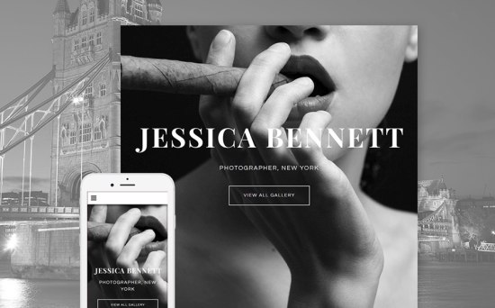
A black and white template, performed in a Gatsby style , however, having the most modern design features like a side hidden menu, elegant image slider, an irresistible-to-click ghost button, is a great option for those who need to create a photography website. Pay attention to the way the information is organized: a portfolio has a grid layout, contact and “About me” information is at one-click reach, and when you hide the menu, you find yourself looking at a full-screen images, presumably created by the same photographer.
Moderno
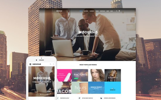
Everyone knows, that marketing consists of numbers and faces. The purpose of a marketing agency web design is raising trust in their potential customers, so presenting the number of cases, customers served, tickets answered, showcasing the positive testimonials may help you reach the purpose. Apart from that, never underestimate the power of Parallax effect, which make a design look deeper and outstand among other similar websites.
Exterior Design
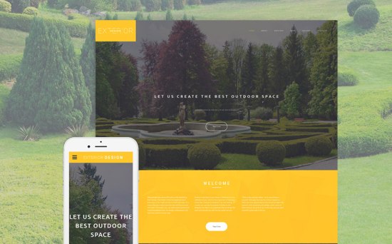
An effect of glass design is reached by a Parallax effect, a ghost button, an unusually placed logo, an unnoticeable back-to-top button, and, of course, the colors used in the design. Cheerfully yellow and calming green would make a perfect color palette for any exterior design business presence.
Deloo
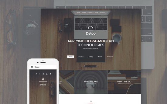
If you are looking for an ultra-modern design where square shape prevails, you may consider using this template. It will look perfectly well on any device thanks to its responsiveness and win the hearts of its customers by its stylish design.
Photographer’s Portfolio
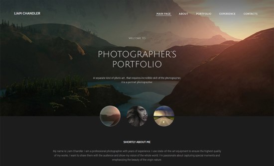
In case your customer is a photographer who needs to emphasize which photoshoots he offers (like wedding photography, portrait photography, catalog shoot etc. ), suggest him to use this design for his website. Here, you’ll be able to combine the elegance and functionality, meeting the requirements of your customer.
Furnicap
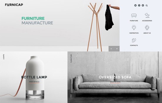
This unusual design is for unusual businesses. If the agency offers something fashionable, modern, courageously –designed and daring, the layout and the look of this template will be a great option. Have a look at it yourself. Image-oriented design, neat widgets, stylish buttons, and, most importantly, minimalistic “Download eBook box” will create a perfect image of a really worthy business.
Timex
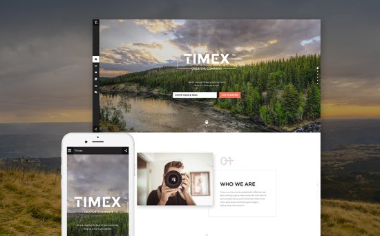
You won’t help enjoy a freedom in design of this template. It intentionally is assimetric, nevertheless keeping the visual balance in it, the overlapping design elements make it different from all typical designs. If you need a project to be remembered and to grab attention of a customer immediately, do not hesitate to use this website template.
Superior
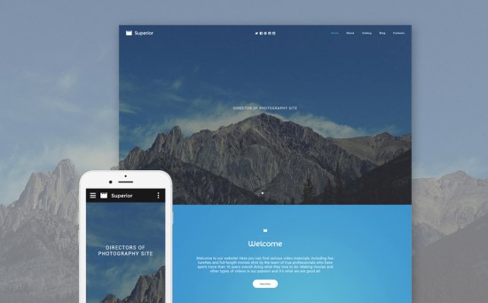
This photography template may be a great choice for those who need to create a website for big photography companies. Segment their offers, prioritize the content, use stunning imagery . Don’t forget there is a Google map at the bottom of this website template, which makes finding the business address easier.
Nature
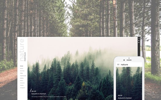
This web design would be especially enjoyed by nature lovers. Its airy design makes it easy to perceive, pleasant to look at and handy to use. Everything that a website visitor potentially may need, is presented at the left part of the template. It has an intuitive navigation, which is so essential in all successful projects.
Eden
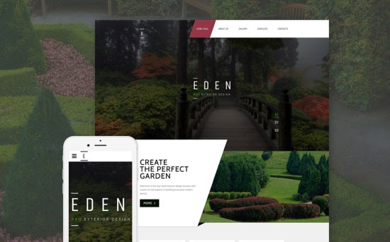
If you need to create a garden design website, get inspired by this template. It is stylish, responsive,client-friendly and green. Slope lines make it look unusual, and this exactly what a design agency needs.
Love Story Photographer
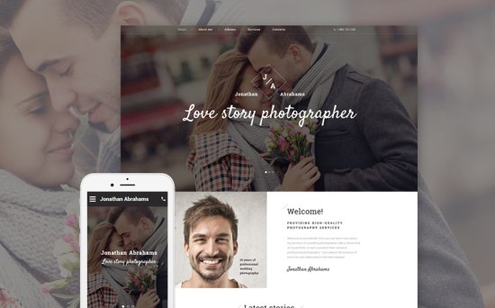
If you’d like to kill 2 birds with one stone and to present the work of the photographer and a photographer bio in one scroll of a mouse, check out this website template. Right under the hero image you will find an “About” section, which instantly makes the project personal, giving it a face. You may point out the services which a photographer offers and a price for them, so that the visitors have all the necessary information from the very beginning.
Inside Our Camera
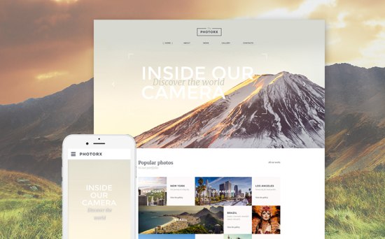
Hardly any other photography website template could represent the statistics better than this one. Alongside a great design, it has a perfect layout, making the data, the blog posts, the services and other information visible. It is bright and memorable.
Rumbic
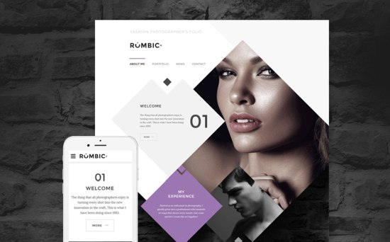
A square is a usual shape, but if you angle it a little bit… you get a rhombus, which is used less often and, thus, makes a design outstanding. Just what a fashion website needs. Use this “torn” effect to create a brilliant project which would attract attention by its very look.
Jose Theme
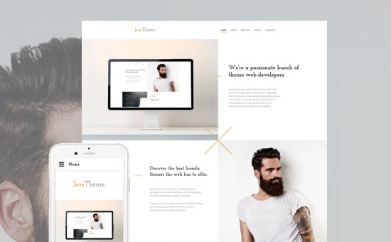
A minimalistic template like this could create a perfect impression – lots of negative space, pastel color palette, a neat and clean layout – every single feature makes this design a great option not only for a design website, but for any other project.
Thunder
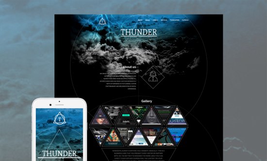
A dramatic look of a website template “Thunder” attracts you even more when you start scrolling down. This design is obviously for a project which associates with mystery and power. Big widgets, powerful imagery, all these things make this responsive template an unusual and really worthy option for you.
Hopefully, you have seen some designs which inspire you. If you enjoyed the web designs offered here, you may check out what other people say about this company.
Create brilliant projects with amazinlgy neat design!