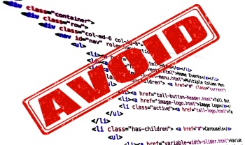
Creating websites is a complicated process and many coders can develop bad practices while creating them. Here’s a few things not to do while web coding and some site features you should avoid at all costs.
Use a transitional doctype
Using the HTML 4.01 “loose” doctype or the XHTML 1.0 Transitional doctype is a bad way to start a website. Instead, code with the strict doctype. Some validation errors are silenced with the transitional doctypes and can cause problems later on.
Write the CSS and HTML simultaneously
When making a website, try to fully write the HTML markup before even starting on the CSS. If you write them at the same time you can often lose your train of thought and it could take longer than it should to code the website.
Use tables for the layout
Tables were never meant to be used for the layout. Not only do tables make your markup ugly but they render slowly and make your code hard to maintain. Do not use tables for your layout! Use div tags for tables.
Make classes and IDs with capital letters
The CSS can become terribly hard to maintain if you have some capital letters in your classes & IDs. Just don’t do it.
Make inline JavaScript and CSS
Writing JavaScript and CSS in the HTML files is a bad idea, since every time you go to a page you have to re-download the CSS and JavaScript if they’re not external. If they are external browsers can cache them and will not have to load them again. I hope you enjoyed these tips.
Site Features That You Should Avoid
When creating websites some features sound like a great idea but in reality they only detract visitors. Even though the <blink> tag is gone (thank goodness!) there are many other equally annoying “features” that people often use, but shouldn’t. Here’s a list of these features you should avoid.
1. Marquees
Marquees were nice back in the 90s, but now they’re annoying and have been deprecated and removed as of HTML5. Readers don’t want to have to wait for the text to scroll so that they can read it all; they want the information now so that they can skip parts that they aren’t interested in.
2. Background Music
Background music is extremely annoying, especially if it automatically plays and/or you can’t stop it. No, we don’t all want to hear your favorite song. Trust us, your website will not gain traffic if you add background music.
3. Tons of Fonts
Having over 2-3 fonts on one page doesn’t look good. You want to focus on content and readability, not how many fonts you can stuff into one page.
4. Text Links
Text links are a very obnoxious way for you to monetize your sites. Visitors don’t want to accidentally bring up a dialog box whenever they accidentally hover over some word. Stick with traditional ads for your visitors sake.
5. Ads with Sound
Though it’s great that I just bought a new speaker I don’t want to hear ads making noise. People go to your site for information, most people tolerate static ads but ads making noise is just too much, especially if your visitor is listening to music.
6. Splash Pages
Splash pages are simply irritating and they make one more step for the user to get to the content. No, they don’t make your website look professional and a big percent of your visitors might abandon the site even before accessing the content itself.
7. Popups
Popups are terribly annoying, they shift the focus away from your site and if I see popups on a site it makes me want to leave.
8. Frame based Designs
Frames are terribly annoying when you’re trying to navigate through a website. Why? Because the back and forward buttons never work properly and if you try to open a link in a new tab you only open that frame, not the rest of the site. We hope you don’t use any of these terrible elements of the web in the future.
The ugliest website of the whole Internet
There are many awful websites but only one can be the ugliest. This example lists all web design taboos you should avoid. Visit BadHTML.com for more examples.