In recent years, the demand for dark mode 🌗 options in web design has surged, driven by its aesthetic appeal and potential benefits for user experience. Dark mode not only reduces eye strain, especially in low-light environments, but it also conserves battery life 🔋 on devices with OLED screens.
Consequently, many websites are now integrating dark mode features to cater to user preferences. In this article, we’ll explore how to implement a dark-light theme switch for your website using HTML, CSS, and JavaScript.
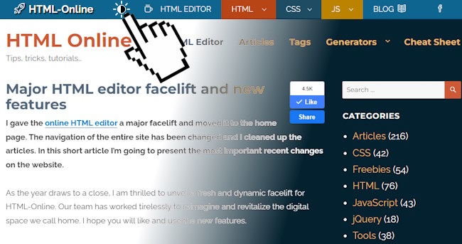
Live Demo
Click the Sun☀️ / Moon🌙 icon to see the background and other colors changing. Since we have also implemented this feature in this website, you can test it in the navigation header on wider screens.
Understanding the Components
Before diving into the implementation details, let’s dissect the components involved in creating a dark-light theme switch:
- HTML markup: The HTML code defines the structure of the switch button and its associated elements.
- CSS styles: CSS is utilized to style the switch button, its overlay, and the SVG icon used to indicate the theme mode.
- JavaScript: JS provides the interactivity by toggling a class on the
bodyelement, which triggers the dark mode styles.
The Implementation Process
HTML Markup
The HTML markup lays the foundation for the dark-light theme switch. It consists of a div container with an ID of wrapDarkLightSwitch, which encapsulates the switch button.
<div id="wrapDarkLightSwitch">
	<div id="darkLightSwitch" title="Dark / Light View">
		<div id="darkLightSvgWrap">
<svg height="20px" width="20px" version="1.1" xmlns="http://www.w3.org/2000/svg" xmlns:xlink="http://www.w3.org/1999/xlink" viewBox="0 0 207.628 207.628" xml:space="preserve"><circle cx="103.814" cy="103.814" r="45.868"/><path d="M103.814,157.183c-29.427,0-53.368-23.941-53.368-53.368s23.941-53.368,53.368-53.368s53.368,23.941,53.368,53.368 S133.241,157.183,103.814,157.183z M103.814,65.446c-21.156,0-38.368,17.212-38.368,38.368s17.212,38.368,38.368,38.368 s38.368-17.212,38.368-38.368S124.97,65.446,103.814,65.446z"/><path d="M103.814,39.385c-4.142,0-7.5-3.358-7.5-7.5V7.5c0-4.142,3.358-7.5,7.5-7.5s7.5,3.358,7.5,7.5v24.385 C111.314,36.027,107.956,39.385,103.814,39.385z"/><path d="M103.814,207.628c-4.142,0-7.5-3.358-7.5-7.5v-24.385c0-4.142,3.358-7.5,7.5-7.5s7.5,3.358,7.5,7.5v24.385 C111.314,204.271,107.956,207.628,103.814,207.628z"/><path d="M200.128,111.314h-24.385c-4.142,0-7.5-3.358-7.5-7.5s3.358-7.5,7.5-7.5h24.385c4.142,0,7.5,3.358,7.5,7.5 S204.271,111.314,200.128,111.314z"/><path d="M31.885,111.314H7.5c-4.142,0-7.5-3.358-7.5-7.5s3.358-7.5,7.5-7.5h24.385c4.142,0,7.5,3.358,7.5,7.5 S36.027,111.314,31.885,111.314z"/><path d="M154.676,60.452c-1.919,0-3.839-0.732-5.303-2.197c-2.929-2.929-2.929-7.678,0-10.606l17.243-17.242 c2.929-2.929,7.678-2.93,10.606,0c2.929,2.929,2.929,7.678,0,10.606l-17.243,17.242C158.515,59.72,156.595,60.452,154.676,60.452z"/><path d="M35.709,179.419c-1.919,0-3.839-0.732-5.303-2.197c-2.929-2.929-2.929-7.678,0-10.606l17.243-17.243 c2.929-2.929,7.678-2.929,10.606,0c2.929,2.929,2.929,7.678,0,10.606l-17.243,17.243C39.548,178.687,37.629,179.419,35.709,179.419z"/><path d="M171.918,179.419c-1.919,0-3.839-0.732-5.303-2.197l-17.243-17.243c-2.929-2.929-2.929-7.678,0-10.606 c2.929-2.929,7.678-2.929,10.606,0l17.243,17.243c2.929,2.929,2.929,7.678,0,10.606 C175.757,178.687,173.838,179.419,171.918,179.419z"/><path d="M52.952,60.452c-1.919,0-3.839-0.732-5.303-2.197L30.406,41.013c-2.929-2.929-2.929-7.677,0-10.606 c2.929-2.929,7.678-2.93,10.606,0l17.243,17.242c2.929,2.929,2.929,7.677,0,10.606C56.791,59.72,54.872,60.452,52.952,60.452z"/></svg>
		</div>
		<div id="darkLightOverlay">
		</div>
	</div>
</div>
CSS Styles
CSS is employed to style the switch button and its associated elements. Key CSS properties include fill, transition, and transform to ensure smooth transitions between dark and light modes.
#wrapDarkLightSwitch{display:inline-block;position:relative;user-select:none}
#darkLightSwitch{cursor:pointer;padding:4px 5px 2px;position:relative;display:inline-block}
#darkLightSwitch svg{fill:#000;height:24px;width:24px;transition:all 1s}
.darkModeOn #darkLightSwitch svg{fill:#FFF}
#darkLightSvgWrap{height:24px;width:24px;overflow:hidden;position:relative;transition:all 0.3s;margin-bottom:5px}
#darkLightSwitch:hover #darkLightSvgWrap{transform:scale(1) rotate(45deg)}
.darkModeOn #darkLightSvgWrap svg{height:44px;width:44px;position:absolute;transition:all 0.5s;top:-10px;right:-10px}
.darkModeOn #darkLightSvgWrap{border-radius:10px}
#darkLightOverlay{width:6px;height:10px;position:absolute;background:#FFF;transition:all 0.5s;top:11px;left:16px;border-radius:0 10px 10px 0}
.darkModeOn #darkLightOverlay{width:22px;height:22px;border-radius:20px;top:0;left:0;background:#456}
/*Your custom theme styles below this*/
body{background:#f7fbff;color:#000}
body.darkModeOn{background:#456;color:#FFF}
JavaScript
JavaScript is listening for the click event on the button and it’s toggling the dark mode class on the body element when the switch button is clicked. This functionality is achieved through an event listener attached to the wrapDarkLightSwitch container.
document.getElementById('wrapDarkLightSwitch').onclick = function() {
    document.body.classList.toggle('darkModeOn');
}
Or, if you are using jQuery:
$(document).ready(function() {
	$("#wrapDarkLightSwitch").click(function() {
		$('body').toggleClass('darkModeOn');
	});
});
How It Works
- Initial Setup: Upon loading the webpage, the default theme is set to light mode.
- User Interaction: When the user clicks on the dark-light theme switch button, the JavaScript function is triggered, adding a “darkModeOn” class to the body tag.
- Toggle Action: The JavaScript function toggles the
darkModeOnclass on thebodyelement, triggering the corresponding CSS styles for dark mode. - Visual Feedback: As the class is toggled, CSS transitions smoothly adjust the appearance of elements, the Sun icon fades into a Moon, providing visual feedback to the user.
Customization Options
You might need to customize this dark-light theme switch to align with your website’s design preferences. This includes modifying the SVG icon, adjusting transition durations, and refining color schemes to seamlessly integrate dark mode into your website’s aesthetic.
It’s going to be your job to implement a dark template that fits your current website design.
prefers-color-scheme
The “prefers-color-scheme” CSS media feature enables detection of user preference for light or dark color themes, based on their operating system or user agent settings.
It applies to embedded elements like SVGs and iframes, allowing customization of their styles based on the color scheme of the parent element. The syntax includes “light” and “dark” values, indicating user preference for light or dark interfaces. An example demonstrates using “prefers-color-scheme” to switch between light and dark themes in HTML and CSS. This feature enhances user experience by adapting website themes to match user preferences for light or dark interfaces.
Using it with media queries
.mytheme {
  background: white;
  color: black;
}
@media (prefers-color-scheme: dark) {
  .mytheme.adaptive {
    background: black;
    color: white; /*Your dark styles*/
  }
}
Detecting with Javascript
if (window.matchMedia && window.matchMedia('(prefers-color-scheme: dark)').matches) {
    // dark theme
}
Conclusion
Implementing a dark-light theme switch for your website enhances user experience by offering flexibility and personalization options. By leveraging HTML, CSS, and JavaScript, you can create a seamless transition between light and dark modes, catering to the preferences of your audience.
Whether it’s reducing eye strain 👀 or conserving battery life, dark mode functionality adds value to your website and demonstrates your commitment to user-centric design.
Incorporate this feature into your website template and empower your users with the freedom to choose their preferred viewing experience.