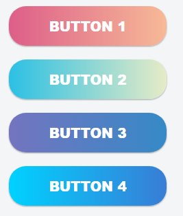
Gradient background buttons with animated hover transition effect implemented with HTML5 and CSS3. Try the onpage demo and see the focus position of the background travelling from one side to the other.
Button 1
Button 2
Button 3
Button 4
The HTML code
We set four links with a common gradient button class and assign a unique class with the color style.
<a class="gradient-button gradient-button-1">Button 1</a><br />
<a class="gradient-button gradient-button-2">Button 2</a><br />
<a class="gradient-button gradient-button-3">Button 3</a><br />
<a class="gradient-button gradient-button-4">Button 4</a>
The CSS code
You can adjust the style sheet below according to your needs, changing the margins, padding and font size. Use the online gradient generator to set up buttons with your own color scheme.
.gradient-button {
    margin: 10px;
    font-family: "Arial Black", Gadget, sans-serif;
    font-size: 20px;
    padding: 15px;
    text-align: center;
    text-transform: uppercase;
    transition: 0.5s;
    background-size: 200% auto;
    color: #FFF;
    box-shadow: 0 0 20px #eee;
    border-radius: 10px;
    width: 200px;
    box-shadow: 0 1px 3px rgba(0,0,0,0.12), 0 1px 2px rgba(0,0,0,0.24);
    transition: all 0.3s cubic-bezier(.25,.8,.25,1);
    cursor: pointer;
    display: inline-block;
    border-radius: 25px;
}
.gradient-button:hover{
    box-shadow: 0 10px 20px rgba(0,0,0,0.19), 0 6px 6px rgba(0,0,0,0.23);
    margin: 8px 10px 12px;
}
.gradient-button-1 {background-image: linear-gradient(to right, #DD5E89 0%, #F7BB97 51%, #DD5E89 100%)}
.gradient-button-1:hover { background-position: right center; }

.gradient-button-2 {background-image: linear-gradient(to right, #2BC0E4 0%, #EAECC6 51%, #2BC0E4 100%)}
.gradient-button-2:hover { background-position: right center; }

.gradient-button-3 {background-image: linear-gradient(to right, #7474BF 0%, #348AC7 51%, #7474BF 100%)}
.gradient-button-3:hover { background-position: right center; }

.gradient-button-4 {background-image: linear-gradient(to right, #00d2ff 0%, #3a7bd5 51%, #00d2ff 100%)}
.gradient-button-4:hover { background-position: right center; }
And finally a screenshot image with the buttons for those who use outdated web browsers which don’t support CSS3 but still want to see how these gradient buttons look like:
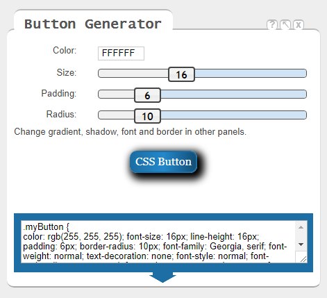
Useful tip
The CSS Cheat Sheet has its own button generator where you can set up the styles of your button in an interactive interface.
Look for the panel pictured below to adjust color, size, padding, radius and change the remaining features like gradient, shadows, font and border int other panels: