Is your web design hurting SEO? When creating a website, you have two audiences to please. The first is your target market. Your second is the search engines, especially the almighty Google.
In fact, you may want to reverse the order because if Google can’t find and index your website, your audience may never find you.
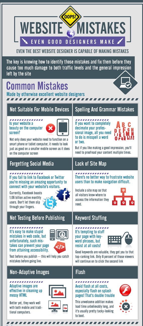
Even the best web designers make mistakes once in a while. Knowing the most common will help you avoid the pitfalls of bad design and overlooked elements.

The Hidden Cost of Bad Web Design
Website builders are suitable for websites that are new to the business, but once your sales go up, you might need to consider hiring a professional designer.
Most businesses look for ways to cut costs and maximize their ROI. That’s understandable, but your website is not a place to skimp.
You may think that you can get away with cutting corners. I mean, as long as your website looks okay, people will love it, right?
But, if it performs poorly or security is lax, you’ll end up spending more for solutions, not to mention the hidden cost of bad design.
Overlooking common mistakes or taking shortcuts when it comes to design will have a ripple effect that seeps into every facet of your growth and marketing strategy.
The unintended consequences of bad design include:
- Lost leads/revenue from people bailing on your website
- Lost time, which equals lost opportunity and money
- Data loss due to poor security
- Ruined brand reputation due to poor performance
- Making a bad first impression
The fact is, taking the time to consider the benefits of a well-designed website – and spending the money to hire someone to do it right – will pay for itself in terms of improved reputation, effective branding, and more business.
5 Common Web Design Mistakes and How to Avoid Them
Some of these errors relate to content and how it’s constructed and marketed. The rest are considerations during the design phase.
Avoid Annoying Your Visitors
There are some previous design elements that were created to increase ad revenue and boost SEO. However, these have also created a backlash and led to penalties by Google. Their main focus now is on user experience (UX).
What are these annoying habits you need to avoid?
The first is video that’s set to autoplay. Originally, it was thought that this would increase viewership, but it has the opposite effect. Many people are browsing the internet in settings where extraneous noise will cause a problem, such as at work or on public transportation. Visiting a web page and hitting a sudden wall of sound is also distracting. Let the visitor control the experience by disabling autoplay. Better yet, include only a thumbnail, if you have lots of video content, and direct your visitors to your YouTube channel for a full view. You can take advantage of this for SEO purposes by indexing the video separately and as part of your page content.
This leads us to annoying design habit number two, which also includes embedded media players that move wherever you’re trying to read: pop ups. It’s disconcerting to have a popup or interstitial appear over the main content before viewers have had a chance to read it. There’s no doubt that such components can be beneficial under certain circumstances, but they should be used judiciously.
Overlooking Coding Elements
Conscientious developers use best practices when it comes to coding. They minify JS and CSS to improve page load times and performance, and they design with security in mind. However, there’s one common mistake that will lead to your page being overlooked completely when the web crawlers come around.
Headers.
Many web developers focus on the back-end. Front-end designers are concerned with usability, function, and flow. But, it’s easy to overlook the part that HTML headers play when search engine bots are indexing websites. Without, at the very least, H1 tags on the main headline, spiders won’t be able to find you.
Hiding from spiders in the real world may be okay. In web design, it’s death.
HTML tags are especially important on the home page because the h1 header is the first thing web crawlers look for when evaluating a page. Many developers and designers omit or remove this tag for the simple reason of saving space. Don’t do this. Make your header tag bold and place it front and center.
Using Bad Layout and Design Practices
Few things lead to a bad user experience like cluttered pages or bad design elements. That font that you thought looked unique may be unreadable to your visitors. You also want to consider your color scheme when it comes to legibility. Too many websites use a font color that’s too light to read easily or too bold and distracting for the reader.

You want to aim for a clean page layout that’s visually appealing and optimized for mobile viewing. Avoid using oversized images that eat resources and inhibit page loads, and create content that’s scannable and easy to read on any screen size. Make sure to put social media buttons at the bottom of the page to avoid traffic that exits your page too quickly.
Your product or service pages are the most important if you’re selling online. Make sure to include at least a service page that describes what you do and how it will benefit the customer. Multiple products or services should each have their own page. This is not only a design best practice, it allows you to double dip your SEO and rank higher for organic search. Make sure that your product or service listings have adequate text to compliment any images, but do not put text directly on the images. More on this below.
Not Optimizing Images
They say that a picture is worth a thousand words, and this is good because too much text can be as detrimental as too little. In order for images to complement your content without causing problems, they should be optimized.
Be selective in the type and number of images you include. If you have a large gallery or an online image portfolio, post only the best and save the remainder for InstaGram or Pinterest.
Images that are too large also affect your page load times. Try reducing image file sizes by 70 percent for improved performance. You can check your page load speed with one of the speed test tools.
We mentioned before the problem with putting text directly on the images. This is good if you’re making memes, but bad for SEO when you’re designing a website. It’s also a very common and widespread mistake. Take a look around the web, and you’ll see hundreds of websites that have an image that takes over the entire area above the fold and has text, H1 headers and all, laid over top of it.
The problem is, web crawlers don’t view images in the same way that people do. They’re aware that you have images on your website, but they won’t be able to view any text on the images. That means your great lead-in with the properly optimized header will be completely invisible to Google. Such text is also small and hard to read on mobile devices. Keep your images clean and place your fancy text above or below them.
Leaving the Default Setting on Infinite Scroll
This can be hit or miss if done improperly. The problem is that, when your page is configured to load only a set amount of content by default, say the first 10 blog posts, that’s the only thing the indexer will see.
Re-configuring infinite scroll is for advanced developers but, you can fix this easily by following the directions on the Google Webmaster knowledge base.
Not Making it Mobile-Friendly
As I sit here at the dawn of 2020, I’m amazed at the number of site owners and developers who are stuck in PC mode. Ignoring the fact that Google announced it was veering toward mobile first indexing last summer, many designers still go with layouts that are a headache for mobile users. These include social platform buttons that are too small to tap, bad fonts, and media that eats up precious mobile bandwidth.
Never forget that your website has to be mobile friendly. Miami’s top web design company states that web development should be focused on adapting websites to mobile devices as well, ’cause you might lose a bunch of visitors and potential customers due to unpleasant user experience.
Final Thoughts
Before you ever talk to a web designer, have a solid idea of what you want your website to accomplish and how this fits in with your business models and goals. Knowing the most common mistakes upfront will save time and protect your investment. That way, you can meet with your developer with more confidence and a better idea of the possibilities when it comes to good design practices.