I have already presented how to draw faces with plain HTML+CSS and we’ve also learned about CSS keyframes animation. Let’s combine these two and create a continuously moving face with blinking eyes looking around and with a smiling mouth. Let’s do this using nothing but plain HTML5 CSS3!
Check out the live drawing at the HTML CSS JavaScript home page or edit the code at JSFiddle.
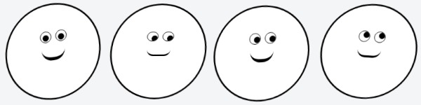
We need to build the structure of the head first. We use a div for the head with a rounded black border and white background. This will wrap the two eyes with the eyelids and the pupils inside them. Finally we add the mouth. This will be an empty div with a border-bottom with rounded edges creating the illusion of a smiley mouth.
If you want to make character-based UI demos feel more expressive, adding animated illustrations can help bring simple motion concepts to life without overcomplicating the design.
The HTML Code
Now we have the HTML skeleton of Bob (because that’s why I call him).
<div id="cssHead">
    <div class="cssEye leftEye">
        <div class="cssEyeLid">
            <div class="cssPupil">
            </div>
        </div>
    </div>
    <div class="cssEye rightEye">
        <div class="cssEyeLid">
            <div class="cssPupil">
            </div>
        </div>
    </div>
    <div class="cssMouth">
    </div>
</div>
Styling the divs to look like a head
For those who are experienced with CSS styling this shouldn’t be a big deal. You might want to come up with your own designs. Here’s how I styled Bob:
#cssHead {
    margin: 20px auto;
    width: 180px;
    background-color: #fff;
    height: 180px;
    -webkit-border-radius: 500px;
    border-radius: 500px;
    border: 3px solid #000;
    -moz-transform: rotate(-2deg) skew(-3deg, -2deg);
    -webkit-transform: rotate(-2deg) skew(-3deg, -2deg);
    -o-transform: rotate(-2deg) skew(-3deg, -2deg);
    -ms-transform: rotate(-2deg) skew(-3deg, -2deg);
    transform: rotate(-2deg) skew(-3deg, -2deg);
}
.cssEye {
    display: inline-block;
}
.cssPupil {
    width: 12px;
    background: #000;
    height: 12px;
    margin: 6px 0px 3px 8px;
    -webkit-border-radius: 20px;
    border-radius: 20px;
}
.cssEyeLid {
    border: 1px solid #000;
    -webkit-border-radius: 20px;
    border-radius: 20px;
    overflow: hidden;
    height: 20px;
    margin: 0;
}
.htmlEye {
    border: 1px solid #000;
    display: inline-block;
    -webkit-border-radius: 20px;
    border-radius: 20px;
}
.wraphtmlEye {
    background-color: #DDD;
    margin: 6px;
    padding: 4px;
    width: 25px;
    height: 25px;
}
.htmlPupil {
    width: 12px;
    background: #000;
    height: 12px;
    margin: 6px 4px 3px;
    -webkit-border-radius: 20px;
    border-radius: 20px;
}
.rightEye {
    margin: 0;
}
.leftEye {
    margin: 50px 4px 0px 66px;
}
.cssMouth {
    border-top: none;
    border-right: none;
    border-left: none;
    border-bottom: 4px solid #000;
    -webkit-border-radius: 100px;
    border-radius: 100px;
    height: 20px;
    width: 45px;
    margin: 0px auto 0;
}
I think there’s nothing much to be explained about the code. Not a big deal, just some borders around positioned divs.
CSS3 Animation Using Keyframes
The styles above won’t make Bob move, we have to set up the animations too. I’m setting up cyclically repeating movements for wiggleing the head, moving the pupils, blinking and moving the mouth. I set various cycle durations for each effect to avoid the illusion of repetition.
Animating The Head
I set a 10 seconds cycle and during this Bob’s head, the div element wrapping the whe eyes and the mouth goes through several rotations.
/*CSS head animation BEGIN*/
#cssHead {
    -webkit-animation: headRotations 10s infinite;
    animation: headRotations 10s infinite;
}
@-webkit-keyframes headRotations {
    0% {    -webkit-transform: rotate(-2deg) skew(-3deg, -2deg);    }
    20% {   -webkit-transform: rotate(2deg) skew(-3deg, -2deg);     }
    25% {   -webkit-transform: rotate(-4deg) skew(-3deg, -2deg);    }
    28% {   -webkit-transform: rotate(-2deg) skew(-3deg, -2deg);    }
    40% {   -webkit-transform: rotate(-2deg) skew(-3deg, -2deg);    }
    50% {   -webkit-transform: rotate(2deg) skew(-3deg, -2deg);     }
    60% {   -webkit-transform: rotate(-6deg) skew(-3deg, -2deg);    }
    70% {   -webkit-transform: rotate(6deg) skew(-3deg, -2deg);     }
    90% {   -webkit-transform: rotate(6deg) skew(-3deg, -2deg);     }
    100% {  -webkit-transform: rotate(-2deg) skew(-3deg, -2deg);    }
}
@keyframes headRotations {
    0% {    transform: rotate(-2deg) skew(-3deg, -2deg);    }
    20% {   transform: rotate(2deg) skew(-3deg, -2deg);     }
    25% {   transform: rotate(-4deg) skew(-3deg, -2deg);    }
    28% {   transform: rotate(-2deg) skew(-3deg, -2deg);    }
    40% {   transform: rotate(-2deg) skew(-3deg, -2deg);    }
    50% {   transform: rotate(2deg) skew(-3deg, -2deg);     }
    60% {   transform: rotate(-6deg) skew(-3deg, -2deg);    }
    70% {   transform: rotate(6deg) skew(-3deg, -2deg);     }
    90% {   transform: rotate(6deg) skew(-3deg, -2deg);     }
    100% {  transform: rotate(-2deg) skew(-3deg, -2deg);    }
}
/*CSS head animation END*/
Eye Animation
The eye has a blinking effect and it’s continuously looking around. To create the illusion of exploring around I’m moving the two pupils together to avoid squinting.
The blinking effect is made with reducing the height of the eyelids to 0. The eyelid is the div containging the pupils.
/*CSS pupils animation BEGIN*/
.cssPupil {
    -webkit-animation: lookingAround 20s infinite;
    animation: lookingAround 20s infinite;
}
@-webkit-keyframes lookingAround {
    0% {    margin: 6px 0px 3px 8px;    }
    10% {   margin: 6px 0px 3px 8px;    }
    12% {   margin: 6px 8px 3px 0px;    }
    27% {   margin: 6px 8px 3px 0px;    }
    30% {   margin: 6px 0px 3px 8px;    }
    40% {   margin: 6px 0px 3px 8px;    }
    43% {   margin: 1px 0px 8px 8px;    }
    46% {   margin: 6px 0px 3px 8px;    }
    57% {   margin: 6px 0px 3px 8px;    }
    60% {   margin: 6px 8px 3px 0px;    }
    63% {   margin: 6px 0px 3px 8px;    }
    77% {   margin: 6px 0px 3px 8px;    }
    80% {   margin: 6px 4px 3px 4px;    }
    85% {   margin: 6px 4px 3px 4px;    }
    88% {   margin: 6px 0px 3px 8px;    }
    92% {   margin: 6px 0px 3px 8px;    }
    100% {  margin: 6px 0px 3px 8px;    }
}
@keyframes lookingAround {
    0% {    margin: 6px 0px 3px 8px;    }
    10% {   margin: 6px 0px 3px 8px;    }
    12% {   margin: 6px 8px 3px 0px;    }
    27% {   margin: 6px 8px 3px 0px;    }
    30% {   margin: 6px 0px 3px 8px;    }
    40% {   margin: 6px 0px 3px 8px;    }
    43% {   margin: 1px 0px 8px 8px;    }
    46% {   margin: 6px 0px 3px 8px;    }
    57% {   margin: 6px 0px 3px 8px;    }
    60% {   margin: 6px 8px 3px 0px;    }
    63% {   margin: 6px 0px 3px 8px;    }
    77% {   margin: 6px 0px 3px 8px;    }
    80% {   margin: 6px 4px 3px 4px;    }
    85% {   margin: 6px 4px 3px 4px;    }
    88% {   margin: 6px 0px 3px 8px;    }
    92% {   margin: 6px 0px 3px 8px;    }
    100% {  margin: 6px 0px 3px 8px;    }
}
/*CSS pupils animation END*/
/*CSS blinking BEGIN*/
.cssEyeLid {
    -webkit-animation: blinkingEye 7s infinite;
    animation: blinkingEye 7s infinite;
}
@-webkit-keyframes blinkingEye {
    0% {    height: 20px;   margin: 0;  }
    58% {   height: 20px;   margin: 0;  }
    60% {   height: 0px;    margin: 10px 0; }
    66% {   height: 20px;   margin: 0;  }
    100% {  height: 20px;   margin: 0;  }
}
@keyframes blinkingEye {
    0% {    height: 20px;   margin: 0;  }
    58% {   height: 20px;   margin: 0;  }
    60% {   height: 0px;    margin: 10px 0; }
    66% {   height: 20px;   margin: 0;  }
    100% {  height: 20px;   margin: 0;  }
}
/*CSS blinking END*/
The Mouth
Our CSS drawing character needs a mouth to smile. The effect is created by reducing the border-bottom of the mouth div to a smaller size then reducing it to the initial measure and position
/*CSS smiling animation BEGIN*/
.cssMouth {
    -webkit-animation: smilingMouth 8s infinite;
    animation: smilingMouth 8s infinite;
}
@-webkit-keyframes smilingMouth {
    0% {    height: 20px;   border-bottom: 3px solid #000;  margin: 0px auto 0;     }
    20% {   height: 35px;   border-bottom: 6px solid #000;  margin: -10px auto 0;   }
    80% {   height: 35px;   border-bottom: 6px solid #000;  margin: -10px auto 0;   }
    100% {  height: 20px;   border-bottom: 3px solid #000;  margin: 0px auto 0;     }
}
@keyframes smilingMouth {
    0% {    height: 20px;   border-bottom: 3px solid #000;  margin: 0px auto 0;     }
    20% {   height: 35px;   border-bottom: 6px solid #000;  margin: -10px auto 0;   }
    80% {   height: 35px;   border-bottom: 6px solid #000;  margin: -10px auto 0;   }
    100% {  height: 20px;   border-bottom: 3px solid #000;  margin: 0px auto 0;     }
}
/*CSS smiling animation END*/
Note that in each animation cycle the last frame (100%) comes back to the initial state (0%) to avoid jumping.