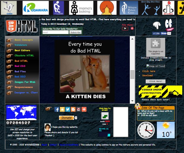
Undoubtedly one of the ugliest websites on the Internet has been launched which wants to draw attention to all the bad practices that web publishers are still using nowadays. This ridiculous website lists everything that cause pain to a skilled designer.
The overall design of the website is very ugly. We see a big table to set the layout of the site on a dark seamless background image. Animated gifs are trying to attract our attention to the conversion funnels but they distract and cause epilepsy instead.
The header section contains a list of failed company logos with underlying meaning, and the logo of the site has a gradient and shadow effect. The menu is a rainbow-colored link list on a gradient background. The site is asking us to switch to Internet Explores and to adjust our screen resolution for the best user experience. A marquee animation, and an on-page music player is distracting our attention.
On the right-hand side big eyes are following our mouse movements and try to convince us to like the page. An unsupported plugin is asking us to install an unknown ChromeVision2000 plugin to play the widget. Going further down we see a missing images and Click here / Download links that we can’t tell what do exactly. An under construction sign is asking us to check back later to see the site when it’s finished.
On the right bottom corner some useless widgets are listed where we can play Tetris, read jokes, see the current weather and see the server time.
Probably the only good thing about the site is that we can switch to a simple design where all these blinking elements are turned off.
We highly recommend to browse this website because it’s funny and on the subpages you can find interesting web design-related articles.
Go on to BadHTML.com
