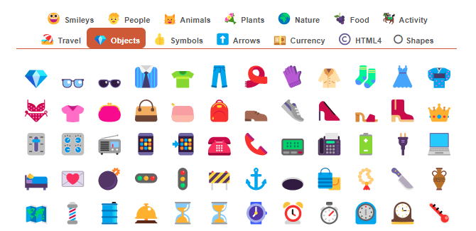
Your icon library looks like a design system had a midlife crisis. Half your icons are from 2019’s “minimal chic” era, the other half are chunky enough to be NFT profile pics, and somehow you’ve got three different hamburger menus living in the same product.
It’s giving design debt realness, and frankly, it’s exhausting everyone 🥵
Mismatched icons aren’t just ugly, they’re conversion killers that make your team look like they’ve never heard of consistency. Users are out here playing icon interpretation games instead of completing tasks, and your designers are having the same “which style should we use?” debate for the 47th time this month.
Time to stop treating icons like afterthoughts and start treating them like the UX elements they actually are. Here’s how to fix your icon chaos without another “alignment meeting” that solves nothing.
The Real Cost of Icon Chaos (And Why Everyone’s Suffering)
Let’s be real about what mismatched icons actually do to your product. It’s not just about looking “unprofessional” – it’s about cognitive load, user confusion, and the slow erosion of trust that happens when your interface looks designed by committee.
What’s happening in your users’ brains:
- Different icon styles create mental friction
- Inconsistent metaphors break learned patterns
- Visual noise kills task completion rates
- Users start questioning if they’re in the right place
The team impact nobody talks about:
- Endless debates about which icon style to use
- Designers rebuilding the same concepts repeatedly
- Developers constantly asking “which version should I use?“
- QA flagging “does this match?” every single review
When your like icon 👍 is a thumbs up, your share icon is iOS-style, and your settings icon looks like Windows 95, you’re not being “quirky“, you’re actively making your product harder to use.
Most teams know this is a problem but treat it like design debt they’ll “fix later.”
🚧Spoiler alert: later never comes.
Four Types of Icon Hell You’re Probably Living In
- Style Soup
Your icons look like they were sourced from five different design eras. Some outlined, some filled, some trying to be both. It’s giving “Pinterest mood board” energy when you need “cohesive system” vibes. - Size Anarchy
Icons that should be the same size but range from 12px to 32px. Visual hierarchy? We don’t know her. - Metaphor Meltdown
Your “home” icon is a house, but so is your “dashboard” icon (but different). Users are confused about which house takes them where. - Brand Identity Crisis
Icons that don’t match your brand personality at all. Your company is modern and sleek, but your icons look like medical device interface circa 2005.
Most teams have ALL of these problems simultaneously. If you’re thinking “we only have the style soup issue,” please audit your entire library. I’ll wait.

How to Build an Icon System That Actually Works
Step 1: The Brutal Audit
Export every single icon in your product. Create a massive artboard and lay them out like a museum of design crimes. This visual shock therapy is necessary.
Step 2: Define Your Icon Personality
Are you playful or serious? Modern or timeless? Write this down because “it depends” is not an answer.
Step 3: Create the Commandments
- Stroke width consistency (pick one, stick with it)
- Corner radius standards (rounded or sharp, not both)
- Style approach (outlined, filled, or duotone – choose your fighter)
- Grid system (24px, 32px, whatever – just be consistent)
Step 4: Build the Master Library
Single source of truth in your design system. Not scattered across files, not buried in folders, not “documented” in a 2022 Slack thread.
Step 5: Usage Guidelines
Document when to use which icons and what they mean. Yes, you need to write down that “home” means “dashboard” not “real estate section.”
📌Pro tip: Start with your most-used icons. Don’t try to redesign 200 icons at once – you’ll burn out faster than a New Year’s resolution.
The Workflow That Prevents Future Chaos
The Icon Request Process (Yes, You Need One):
- Check existing library first (shocking concept)
- If new icon needed: Document use case and metaphor
- Design review: Does it match our system?
- Add to system with proper documentation
📌The “No Random Icons” Rule: Nobody gets to “quickly grab something from Google” anymore. Every icon goes through the system. Yes, even for prototypes. Yes, even when you’re in a hurry.
Making It Stick:
- Assign an “icon owner” (someone who actually cares)
- Regular audits (quarterly, not “when we remember”)
- Add consistency to design reviews
- Make using system icons easier than finding random ones
This isn’t about being the design police: it’s about making good decisions easy and bad decisions harder.
Tools That’ll Save Your Sanity
- Icons8: The absolute unit with 119 different styles of consistent icons (yes, 119 – they’re not playing around). Want outlined? They got it. Need filled? Covered. Duotone? Obviously. It’s like having a personal icon army that actually matches.
- Lucide: Clean, consistent, actually modern
- Phosphor: Scales beautifully, multiple weights
- Figma Icon Components: Your best friend for consistency
Implementation That Won’t Kill Your Team
Phase 1: Stop the Bleeding (Week 1-2)
- Audit existing icons
- Create basic guidelines
- Implement “no new random icons” rule
- Start with high-visibility icons
Phase 2: Build Foundation (Weeks 3-6)
- Design core icon set (20-30 most-used)
- Create component library
- Write usage docs
- Train team on workflow
Phase 3: Systematic Replacement (Weeks 7-12)
- Replace icons by importance
- A/B test critical changes
- Update documentation
- Establish maintenance processes
Managing Expectations:
- Show before/after examples
- Emphasize UX improvements
- Set realistic timelines
- Budget for ongoing maintenance
This isn’t one-and-done – it’s an ongoing commitment to design quality.
Your Icon Glow-Up Starts Now
Fixing your icon situation won’t win design awards, but it will make your product usable, your team efficient, and your users less confused.

Mismatched icons are symptoms of deeper design system problems. If you can’t get icons consistent, you’re probably struggling with everything else too.
Your next moves:
- Do the brutal audit (seriously, export everything)
- Pick a consistent style (and stick with it)
- Create the system (components, guidelines, docs)
- Implement gradually (don’t fix everything at once)
- Maintain religiously (consistency requires effort)
Great design isn’t about having the prettiest icons – it’s about having icons that work. Users don’t care if your save icon is “on-brand” if they can’t figure out how to save their work.
Stop overthinking and start fixing 🔧 Your users (and your sanity) will thank you.