You want improved conversion rates on your website. Conversion rates mean revenue. You know that design plays a role. However, you might have some questions about what design principles have the biggest impact on your conversion rates.
You likely heard “experts” talking about the importance of social media, search engine optimization, and getting lead magnets that convert. These things are exceptionally important. However, none of them matter if there is not a quality website to back them up.
Your web design is not just about making your site look cute. A well-designed website can make or break your business. Anyone who wants to become a skilled UX designer understands the correlation between a site that people enjoy using and a site that generates revenue.
People judge the quality of the business behind the website by how professional the design looks. Just think, if you landed on a page that looks like it was last revamped in 2001, you are going to navigate away and lose all confidence in the business behind it.
The following are six web design tricks that can improve your site and boost your conversion rate.

1. Make Good Use of Negative Space
Negative space is a blank area on your webpage. When used properly, this empty space can highlight or draw attention to a specific element.
When properly used, negative space forces visitors to click on a landing page element because the element is all by itself. It forces them to look at it because it is all that is there.
Negative space, also referred to as white space, is not necessarily white, but it is empty and unmarked. It should separate unique elements on a page. It should contrast other elements with the one element you want to highlight.
Besides being enjoyable to look at, white space improves focus, increases readability, improves the user experience, and makes it easier for the user to comprehend the offer.
Negative space leads to conversions because it taps into the visitor’s psyche. Being bombarded with too much data can lead to cognitive fatigue, preventing the brain from absorbing information and reacting to it.
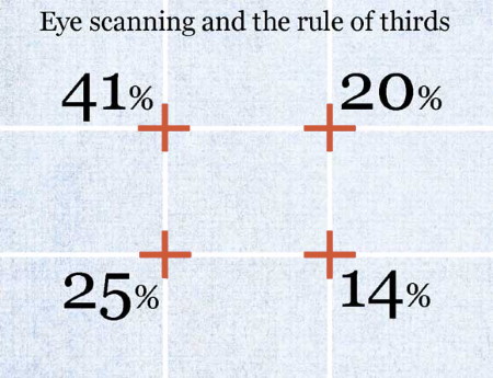
2. Use the Rule of Thirds
The rule of thirds is commonly used in photography. It is equally important in web design. With the rule of thirds, you divide the screen,image or website into vertical and horizontal thirds. You are left with nine equal squares.
Based on this rule, the four intersections in the middle are where people’s eyes travel to. Images placed in these areas create the largest impact. Therefore, place the most important elements in these strategic areas. An example would be including your call to action button.
Just because it’s called the rule of thirds does not mean that your entire website needs to be designed by this rule. However, you want to use it as a basis to determine where to put elements on your site.
3. Understand the Role of Colors
Many people downplay the role that color has in web design that leads to conversion. However, color greatly impacts the usability of a website and the mood of the website. Color evokes emotion, so different color combinations invoke different emotions.
A contrast in colors can help headlines and call to action buttons be more noticeable. The places you want your users to look should have a noticeable contrast with the background. It’s worthwhile to do some research on which colors convert the best.
4. Remember That Users Are Impatient
This impatience is magnified when surfing the Internet. Some research even showed that one second delay could lead to a seven percent drop in conversion rates. The takeaway is that with conversion rates, each second matters.
You should frequently check your page speed. If there are any issues that are slowing your site down, fix them immediately. If the problem can’t be fixed with a proper optimization, maybe your web hosting provider doesn’t offer load times that are fast enough. Will Elis from Privacy Australia group tested popular web hosting solutions and his research showed that in order for your business to succeed you need to find a web hosting solution that offers a load time that is less than 2 seconds. Otherwise you’re losing a significant amount of visitors and potential customers.
5. Use the F Pattern
Using the F pattern allows you to build a visual hierarchy. You can put your call to action in the best location for conversion. The F pattern refers to how our eyes move when reading content online. This is something that most people do without being aware of it. The F pattern goes like this:
- Read the top of the page to identify important headlines
- Read down the left side of the page to identify bullet points and numerals
- Read across the middle of the page to identify text in bold and subheadings
There are some slight variations seen in the F pattern. Some visitors may use a pattern that looks like an upside-down L. Others may read in a pattern that is like an E. Using the F pattern principal, you can strategically place important elements where your users are most likely to view them.
6. Hicks Law
Hicks law states that the time it takes for a person to make their decision is proportionate to the number of choices they have. If you give people more choices, the time to decide increases.
There have been studies done on this principle. For example, they set out a table offering 24 different jams. Another table only offered six varieties. The table with the six varieties generated more interest and led to more sales than the table with 24 varieties. The takeaway is that people are less likely to convert if they get presented with too many choices.
You can boost conversions on your website by minimizing the options visitors have. Start with the navigation bar. Don’t include more menus than you really need. The more options present on the navigation bar, the more choices visitors have relative to the decision to convert.
Conclusion
These are a few of the design principles that can lead to improved conversion. Now that you know them, why not look over previous web design jobs you have done and see if by applying these principles you can improve conversion rates? Identify principles you are consistently breaking. Thankfully,many of these problems can be fixed quickly and easily with just a few adjustments.