Are you looking for ways to generate the maximum revenue for your web project? To gain the expected feedback from your audience, you need to think about the implementation of wise conversion-oriented techniques on your site. If you want to achieve success in your approach, then you need to think about the way people browse the web. They may be using different devices and web browsing apps. A modern user is multi-tasking and keeps several tabs open in his browser window. So, keep his attention focused on your content and encourage that person to take a specific action, you need to implement a wise conversion-oriented strategy.
The following tips can be applied to a new business site (including the ones created with web themes and online projects that you’ve already brought online.
What is a Conversion Rate?
The conversion rate is expressed in percentage form based on a ratio. It shows how many visitors to your website converted on an offer. This can be any action that you suggest to your audience to take. For example, you can welcome them to register in a webinar, place an order, respond to a sales magnet, sign up for your email list, etc.
If you do not know your site’s conversion rate, then you simply don’t know what elements of your online marketing strategy work well and what needs improvement. This knowledge will help you to work wisely on your online strategy, improve it, and your conversions will likely show the anticipated leap.
How to Calculate Your Conversion Rate?
For example, let’s assume that you create a landing page that asks people to subscribe to a service. There are 5000 people who visited your landing page during the campaign. 350 people converted into leads. To calculate the conversion rate, you need to divide conversions by the number of visitors to your landing page, and then multiply the result by 100. In this example, your conversion rate is 7%.
How to Increase Your Conversion Rate on Your Website
To increase the conversion rate on your site, you need to know what works with your audience and what needs improvement. A person who lands on your web page is likely to have certain expectations, needs, and pain points that your website should address.
If you sell some products or services, it’s okay that people don’t convert the moment they see your offer. It takes time before people realize if they need you deal. This is also likely that people will come back to your copy over and over again to make the final decision. To stick to the users’ minds, you need to work on a compelling copy, effective CTAs, and catching design. People might come back to your web page and convert.
Let’s look at the 10 techniques that will help you increase your conversion rate.
Optimize your conversion funnel
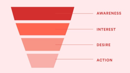
There is a generally accepted conversion funnel that consists of the four primary elements:
- Awareness;
- Interest;
- Desire;
- Action.

Based on this scenario, you can find out what engages the interest of your audience, encourages them to check out your product, and make a purchase as a result. To craft a product that will bring you the necessary number of leads that will convert into sales, listen to your gut and bring to life what it says. Listen to the opinion of your customers and see what experts say about your offers, run tests, and apply to your site the techniques that have proven to be the most effective for your audience.
Test everything
You need to know what’s working and what’s not on your site. This deals with everything starting from the design of your site, the frequency at which content appears on your web page, lead magnets that you use, etc. You can find this out through the regular testing of different techniques and approaches to your audience.
To come up with the best working formula for your site, you can run all kinds of maps on your site. This lets you find out where people click or stop scrolling on your site, where they make a purchase, and at what stage they leave your web page.

If you notice that a web page that you suggest to bring you a certain number of conversions, then you should consider optimizing it. You can experiment with different ways of data presentation, change the design, the location of CTA buttons, etc. If you need to delete the page entirely, then do not forget to add a 301 redirect to a different page on your site so that you do not lose your audience.
Work on the design of your web page
The content that you add to your web page is important. However, the design of your web page also brings big value to your web resource. Different sites prefer different designs. Once again, the selection of the best design for your site is based on the preferences of your audience.
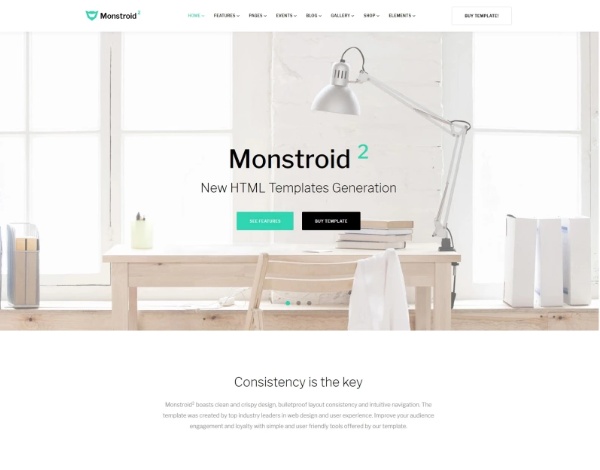
In many cases, the owners of business web projects prefer simple minimalist designs that make people feel comfortable when browsing the content, looking for the necessary pieces of data. Simple, clean and clear design have been in great demand for the last couple of years. We suggest that this tendency will remain in the nearest future as well. Minimalist web designs are easy to implement with the help of business website templates like the one listed below.

Experiment with different types of forms
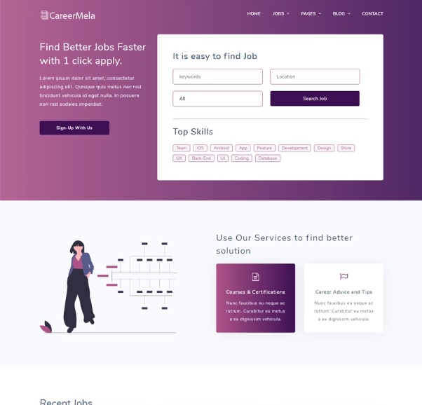
Contact forms play an important role in business websites. A usable form often becomes a stopping point on a website. It’s important to keep forms simple and intuitive to use. When a person sees a form that contains a number of unnecessary fields, he is likely to leave for a web page that eliminates unnecessary fields.
Test how your contact form works on your landing page. Do most of your visitors click away once they reach your form? Then you might have a problem.
By means of a simple form, you can qualify your leads. Do not include unnecessary fields. Focus on the essentials instead. Try different color variations and alternate CTAs. Play with different form layouts, the placement of form elements, as well as space between them.

Use different CTAs
There is no one-size-fits-all rule when it comes to the choice of the best CTAs for your site. You need to test different forms and texts of your CTA to come up with the perfect choice for your site. Sometimes a simple single-word CTA (like BUY) is enough for a user to convert. On other sites custom CTAs containing several words have a better effect on the audience.
One of the most high-performing CTA for a special offer landing page is the one that starts with the word “Yes”. It has a positive psychological impact on the audience because it offers a positive light to your message.
Run A/B testing with the collected data
There is plenty of software that lets you track the performance of your web page. For example, you can make use Crazy Egg that will collect recordings and visual reports, and provide you with deeper insights on the techniques and approaches that have the best effect on your audience. To come up with the perfect formula for your site, you need to run up to 10 A/B tests to compare the results and see what converts better.
Build trust with testimonials
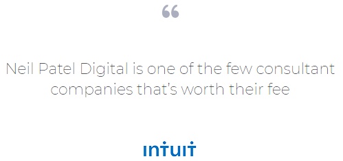
This is always a win-win solution to gain user trust while revealing customer testimonials. For example, you can showcase quotes from some of your high-profile clients by means of carousel sliders on the homepage.

You can also opt for a different approach and build trust while revealing a list of brands and well-known names that your company works with.
Provide a money-back guarantee
It’s important to make your customers feel certain that they are protected from the risks when dealing with your brand. Putting a money-back guarantee to your site, you keep our clients informed they avoid all the risks when then buy from you. This helps assuage fears and move past objections.
Add videos to your site
A picture can say a thousand words. A video is way more effective. Such content lets you better engage with your audience. It helps people better learn about your offers and brings in more leads to your project.
Putting a video on your product page, you introduce your customers to the unique features of a certain solution. You can also share explainer videos, interviews, screencasts, user testimonials, and more.
Avoid distractions
As it’s been figured out by WordStream, you can boost conversion rates by 40% while removing navigation links from the landing page. You will have fewer conversions if you distract users from the main goal of your site. Focus on the essentials and remove as many distractions as possible. See how your intentions will impact your conversion rates and keep on adjusting your web page accordingly.
Speed matters
To improve user experience on your site, keep an eye on the speed at which the content of your site loads in a browser window. If your site loads slowly, then people will likely leave for a different web page, without waiting for all elements of your site to appear on the page.
Apps like Google’s PageSpeed Insights provide you with the detailed instructions on how to speed up your site.
It’s time to act!
By means of the tips explained in this article, you can bring positive changes to the conversion rates on your site. With these tips in mind, try to see what effect it will have on your audience. Test your own site because the best results are achieved by trial and error. Do records every time to implement something new. Apply your new knowledge through A/B testing and see a rise in conversion rates on your site.