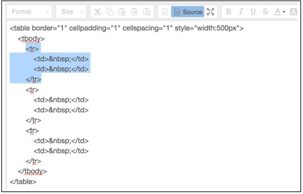
Let’s start with the quote by Douglas Engelbart, an early computer and web space pioneer known for his work on founding the human-computer interaction field. It says that “the digital revolution is far more significant than the invention of writing or even printing”. You may or may not believe these words, but let’s be honest! The impact the technical progress has on our lives is impressive. With it, each part of the user’s everyday routine became easier, quicker, and simpler. The online HTML editor will guarantee that your markup is always clean and error-free.
You can see the results of the digital revolution literally everywhere! Just take a closer look at the modern world. All the products are easy-to-get when all the services are wholly customer-oriented. Business people all over the globe put a lot of effort to make their companies as prospect-friendly as possible. Now, you can buy whatever you need and find any information without a hitch. Actually, a handy gadget and Internet connection are all you will need.
There is no business niche which was able to avoid the changes the innovations brought. It looks like, in 2019, the digital progress reached its peak. What used to be complicated and expensive becomes affordable and easy-to-use. Do you remember the days when you had to pay big money and hire a developer to build a primitive landing page? Today, you can choose from multiple best-selling website templates, and voila!
So, if you are on this page, you are most likely going to run a website. No wonder, in 2019, it is a #1 must-have for business and even personal promotions. Latest technologies allow people to design groundbreaking projects in a painless way. However, when it comes to HTML and CSS, many beginners still make the same mistakes. According to the study, there are 3 main kinds of errors:
- 70.9% of them belongs to skill-based mistakes,
- 16.9% are rule-based ones,
- and 12.1% are knowledge-based errors.
In case working with website templates made you feel hooped, don’t panic so fast! In this post, I’ll teach you how to avoid the repeating HTML- & CSS-related mistakes.
#1 Messy CSS Organization
One of the common mistakes users make when writing CSS is weak structuring. They mostly focus on content and website visual elements instead of organising styles in a logical way. Usually, beginners write up their CSS in the order they think of them. As a result, users can’t find a style declaration when it is time to change it.
So, here is my #1 tip for those who are about to write CSS: always organise your code! Such a step will save time and facilitate the working process. How should you do that? I recommend you to structure CSS according to the organization of HTML you work on. For example:
- header,
- body,
- sidebar,
- and footer.
#2 Wrong Block Elements Placing
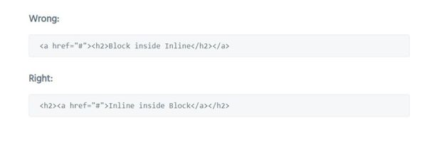
This widespread HTML website building mistake also relates to the organisation. Long story short, by default, an HTML element will be displayed as Block or Inline. And that’s the problem! Although we live in the age of smart technologies, a lot of users place block elements inside the inline ones.
To avoid the mistake, note that:
- block elements make up the structure of your document, e.g. paragraphs or divs,
- inline elements belong to the blocks, e.g. tags and anchors.
Inline elements reside in blocks, but they are not the same. You should never put blocks within inline components.
#3 Missing DOCTYPE
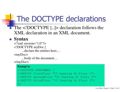
For starters, DOCTYPE shows different browsers your current version of HTML. Without it, you can’t be sure the code is valid. When there’s no DOCTYPE, the browser starts making assumptions. In this case, the result of your work can be not so lucrative you have imagined.
To avoid it, you need to follow the next tips.
- Use DOCTYPE, no matter which kind of HTML you have.
- Always place it in the first line of the code source.
- Be careful because DOCTYPE is case-sensitive.
- Create a blank doc template to save your DOCTYPE so that it will be close at hand.
- Get use of some HTML validators and CSS tools to find possible loopholes.
#4 Missing ALT Text
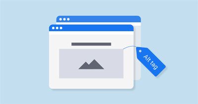
As you can see, DOCTYPE is not the only thing people regularly miss when working with HTML website building. It comes for ALT attribute as well! Keep in mind, any image you add to site content must have ALT text. Why?
- ALT text is meant to describe what is on your picture, like <img src=”image.png” alt= “image description ” class=””>.
- IMG tags require these attributes.
- Users but mostly screen readers use ALTs to understand if the image is vital.
- When appropriately used, ALT text lets spiderbots better index your content.
#5 Forgetting About Print Stylesheet

Although it’s easy to include a print stylesheet in website code, users often miss this step. You need it to style the online project on printed pages. Here is how it looks: <link rel =”stylesheet” href =”print.css” media =”print” />.
Basically, with the help of print stylesheet, you can:
- hide elements you don’t want printed,
- reset the background colour to white,
- provide alternative fonts for paragraphs to make them fit the paper format, and much more.
#6 Code Tables Carefully
The best is to avoid table tags and use structured divs instead. Among the common culprits of the wrong HTML, I want to highlight tables. People think browsers turn a blind eye to it. Yet, when it comes to assistive technologies, the incorrectly coded tables can ruin your reputation. Here are the most popular table mistakes users make in 2019:
- they don’t close th and other tags,
- place tables within the inline elements,
- insert <td>’s outside of <tr>,
- and create tables with various numbers of cells in a row.
#7 Neglecting Character Encoding
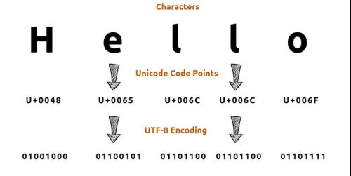
As the name of the point says, the next popular HTML mistake refers to missing character encoding. To put it briefly, no matter what your website was made for, any web page must define its current character set. The thing is that these sets show browsers which characters you use in the page.
Needless to say, character sets vary, depending on the language of the website. With it, the English-languaged pages and the ones with Chinese characters will have completely different sets. Seeing that, you can’t miss character encoding! It explains to browsers and assistive devices which kind of data they should read and display.
#8 Styling Content Before Choosing Default Fonts And Colors
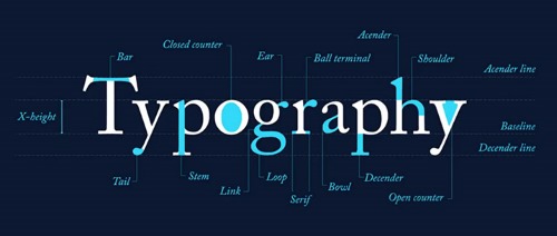
This mistake is popular among the owners of online portfolios, galleries, and other websites based on visual content. Such projects always have numerous illustrations with the creator’s name in the middle of the screen. Also, they come with supporting text.
Would you like to get it? There is nothing complicated. Here is your HTML:

Once you are through it, you will want to add different classes or writing selectors. Does it sound familiar? In this case, I want you to stop right now because here is another common coding mistake. You should never style content before you have chosen typography it will come with. By the way, before adding new content to the site, you need to set up default colours too!
Here are a few recommendations for you:
- default size of your fonts should be 16px – 20px,
- 1.5 – 1.85 would be a nice default line-height,
- avoid full black #000000 when it comes to colours (you can replace it with dark grey),
- for the page background, white #ffffff is a conventional choice,
- to turn down the contrast for the page background, use slightly-off-white colours, like #f9f9f9.
#9 Missing Basic Tags
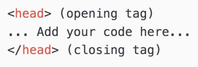
Keep in mind that all head content (e.g. <title>, <meta>, <style>) requires these basic tags:
- <head>
- </head>
#10 Missing Close Tags
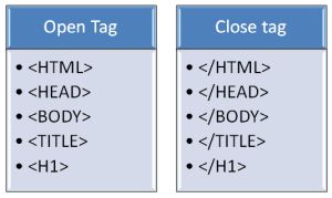
So, here is one more common HTML trouble. When some beginners forget about all basic tags, others miss the close ones, like:
- </ body>,
- </ p>,
- </ html>.
#11 Using The Wrong HTML Extension For Image Tags
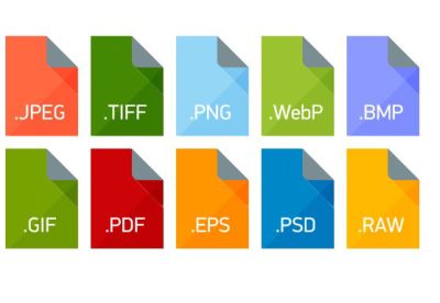
To finish with, let’s pay attention to this popular HTML extension – align=absmiddle. Yep, it’s commonly used all around the globe. Nevertheless, it doesn’t make the attribute suitable for all purposes. Note, align=absmiddle is not what you need to create a proper HTML for the image tag!
Can you see something like <img src = “image.gif” align = “absmiddle”>in your code? Well, it should be fixed tho! Although many browsers support the extension, with it, your HTML becomes incorrect. I recommend you to use align=middle instead.
Final Thought
As you can see, there are many repeating mistakes HTML users make in 2019. Some of them are not as critical as others. And some can ruin your site in a drop of a hat. All in all, to get success, you should have a clean, valid, and semantic code. With the named points, it won’t be possible, even if your mistakes are the small ones.
By tradition, I saved a couple of tips for last. Here are additional HTML and CSS recommendations to check out.
- Never use <blink>and <marquee>.
- Don’t use multiple breaks to show a list.
- Besides, don’t use multiple line breaks at all.
- For bolding, use <strong>, not <b>.
- Stop adding/removing the border attribute in HTML.
