Being a web designer is not easy these days. Apart from doing your main job – designing websites – you also need to master a whole range of new tools and technologies. That includes languages like HTML and CSS.
But it’s not as hard as it may seem at first.
We did a lot of experimenting with these two languages in the field of web design, so we decided to create a list of the most useful features. Let’s see 10 HTML/CSS tips and tricks that can make a designer’s life much easier.
Take advantage of the CSS preprocessor
Some web developers think preprocessors like Sass and LESS are a waste of time, but this is not true – especially if you are a designer. Using these tools can actually make your life much easier and your work more manageable.
First of all, you will be able to manage the code much better, which also means that it will be easier to avoid any errors. Secondly, these preprocessors allow you to include all the necessary variables and functions in one file, so it will be much faster than writing them all on your own.
Make sure to compress your CSS code before going live.
Design a hamburger menu for mobile devices
One of the most popular methods for responsive navigation is the hamburger menu or just the navicon ≡ (≡). The main idea behind this technique is to move the entire site’s links to the left side of the screen on mobile devices, making them accessible by clicking three lines in the upper-left corner. Adding a few JS lines is all it takes to create this menu.
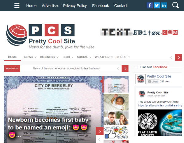
Website design using the hamburger menu
Use transitions and overflows
If you want to create a nice smooth animation between two or more different blocks, then you should definitely know about CSS transitions and the overflow property. Using these features will allow you to animate any block – from images to text.
This method can prove useful in creating responsive full-screen animations as well as simple hover effects. But when you are designing the layout, make sure to set up all of your CSS properties first.
Set a fixed header
Another cool trick is to create a fixed header on your website. This means that the upper part of the page will stay still while you are scrolling down, revealing some additional information below it.
Sticky header with input filed and hamburger menu
Creating this effect can be done with just a little bit of JavaScript – jQuery works fine for example. Just make sure to change all of your CSS styles so the header will not break the other elements on your page.
You might start with a free website template with sticky header for your next project.
Create an interactive image gallery
You can also use your HTML knowledge to create a cool effect for your image galleries. This technique is well-known in web design, and all it takes is using the hover selector in combination with CSS transitions. Creating this effect is pretty easy and the best thing about it is that you don’t need to use any JS.
Customize website buttons
Customizing your HTML buttons is another useful thing you can do. You can change their color, for example, or add some cool effects to them. This method doesn’t require much HTML/CSS knowledge, but it can definitely make your website look better and more attractive.
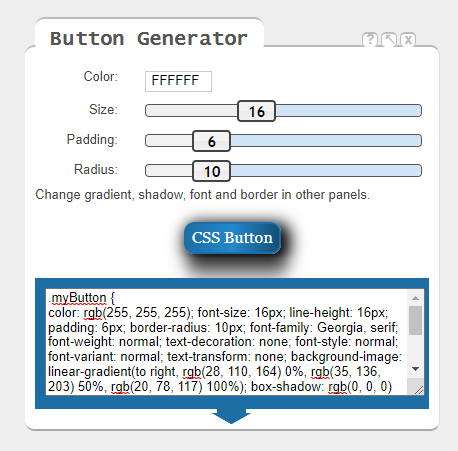
The online HTML Cheat Sheet has its own button generator
Here’s what you can do:
- Adjust the size
- Add a box-shadow
- Create round corners
- Include hover effects
- Set maximum length and width
Make images responsive
Making images responsive nowadays has become an easy task, and it does not require much coding knowledge. Using a few lines of JS is all you need to resize images according to their containers.
img {
    max-width: 100%;
}
But what if you’d like to change the image’s aspect ratio instead of just resizing them? You can do this by using either CSS or jQuery.
- To use CSS, you will have to set a maximum aspect ratio. You can do it by either specifying a width or a height in your image.
- To use jQuery, you will have to resize images based on their containers and create some custom CSS code for changes on the page (such as adding a title to an image).
Add … for long portions of text
If you want to highlight a certain point of your text, then the ellipsis is what you need. This symbol indicates that there are more words to come and at this specific moment you cannot view them all.
…
But if needed, you can also use three dots or any other unique symbol. This typography mark is mostly used to indicate that content was cut off. A good example of this would be an email program that does not let you see the entire text before sending it.
Create your own icons or use web fonts for them
You can also customize some elements on your website, including icons. If you don’t know how to create your own icons from scratch, then you can definitely use font files. This way, you’ll be able to add custom icons much faster without even having to code.
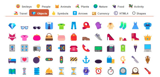
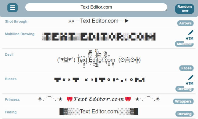
Online special character picker
Using web fonts also reduces the possibility of broken images or missing icons in general. That’s because these special characters are supported by all major browsers and they won’t leave your viewer confused.
Generate fake Lorem Ipsum text
To make your website or application look better in the development stage, you can replace all of the real content with “Lorem ipsum” dummy text.
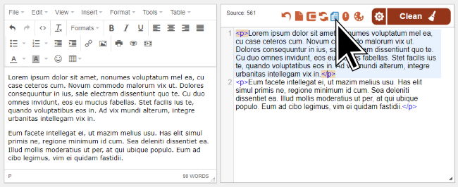
Our online HTML Editor has a built-in gibberish text generator
This placeholder text will allow you to see what your design looks like without having to actually write anything. It’s also a great way to test your designs and see if there are any content issues.
Conclusion
Listing all HTML/CSS tricks into a single article is not easy, but we did our best to show you the most useful ideas. Are you ready to give them a try?
Make sure to use our online tool collection – like the editor – to make your life easier. They can be all accessed through the header navigation.
Author: Charlie Svensson
Charlie Svensson is a creative and engaging freelance writer at the essay review service. He is extremely skilled in content writing and blogging, while his main interests include IT, new technologies, social media, and marketing.
