Logos play a crucial role in establishing future trends and are extremely important for supporting brand awareness. With customers becoming increasingly careful of what they are purchasing, logos are necessary today.
![]()
A logo will grab the attention of the customer and help them make a decision. If the logo leaves a strong first impression on the viewer, then the chances that he or she will purchase the product increase. But logos are not only necessary for getting the attention of the client – they set up the foundation for your brand.
Famous Examples
Here are the top 25 revolutionary logos from past trends that you should consider.
1. Nike
In 1971, Nike’s logo looked way different. The founder of the company thought the swoosh symbol might not be as successful as it is today. But he was, obviously, wrong. The swoosh symbol became way popular than imagined.
![]()
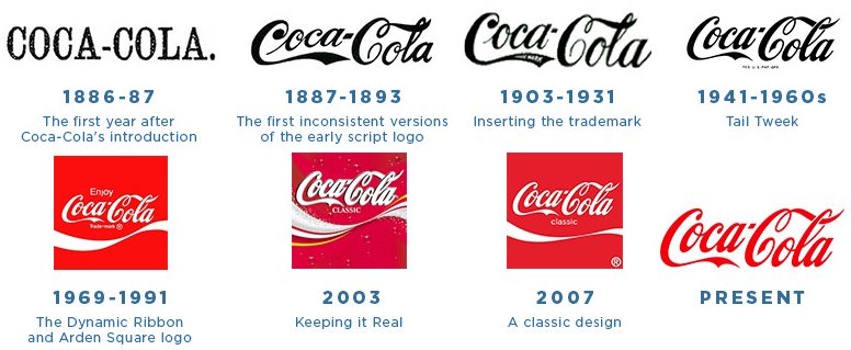
2. Coca-Cola
The Coke symbol was first created by an accountant named Frank Mason Robison, who decided to give it a try in the late 1800s. At first, the symbol was black and white. In 1950, red was added to it and the logo started looking how we know it today.
3. Ford
Ford looked way different in 1903, too! The decorations were too much for what Ford was supposed to signify. Only in 1912, the company started re-designing it according to how we know it today.
![]()
4. Apple
In 1976, Apple didn’t even come close to today’s design. The idea behind the logo was then based on Newton’s gravitation law, explained. When Steve Jobs took over, the whole idea behind this outdated concept changed. Between 1977-1998, Apple suffered many colorful changes, only to become grey in 2013.
![]()
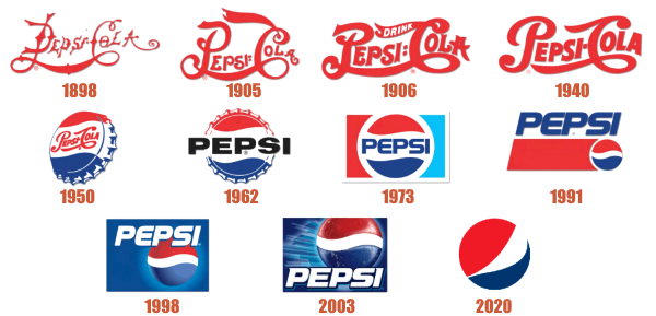
5. Pepsi
Pepsi-Cola until 1953, this logo changed along with the company. Red and blue were added back in 1945. In 2009, the logo suffered the last changes.
6. Mercedes-Benz
This logo is simple and classic – in other words, it demands respect. Mercedes was the name of Daimler’s daughter. The new minimalist emblem signifies Mercedes and Benz blended together, according to logo coordinator, Travis Groom.
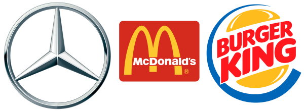
7. McDonald’s
First known as McDonald’s Famous Barbeque, the company switched to its present name only in 1960. In 1992, 2000, and 2003, it suffered continual changes, only to become the simple, yellow M in 2006.
8. Burger King
Back in the days, the symbol featured a king sitting on a burger – funny, right? Soon, the character disappeared, and the new emblem came to life. Burger King’s new logo dates since 1999.
9. Google
![]()
Google has caught the eye of the public since its beginnings, in 1997. The company used red, yellow, green, and blue from the start, and it still does today. In 2015, the company’s logo was modified for the last time.
10. Warner Bros. Pictures
This is probably one of the only symbols that date back to the beginning of the 20th century. It hasn’t been modified at all until now and it’ll probably stay this way – classic, serious, fancy, exquisite.
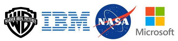
11. IBM
Renamed International Business Machines in 1924, this company’s logo went from black to black to black to black… to blue, in 1972. Its minimalist style was first designed in 1947.
12. NASA
NASA’s logo is one of a kind, always to be remembered. It features a sign, the meatball, a logo, the work, and a stamp. This sign was approved by many U.S. presidents such as Eisenhower or Kennedy.
13. Microsoft
Microsoft’s logo speaks for itself. Simplistic, casual, but effective, the logo’s colors stand out anywhere. Visual design is one of its best features.
14. Starbucks
Starbucks’ symbol changed over the years but in a way, it stayed the same. In 1971, it was black and white, and starting with 1978, green was added to it, making it “cooler” and more visible.
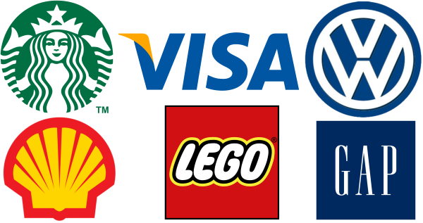
15. Visa
Visa’s colors stayed the same since 1976, and its effective logo didn’t suffer huge changes. In 2014, Visa gave up on the yellow-mustard design, and stuck to plain blue.
16. Volkswagen
VW’s logo suffered changes over the years, especially after WWII when it had to be changed because of its association with the Nazis. In 2000, the logo was designed as how we know it today.
17. Shell
Since 1948, Shell started using yellow and red interblended to catch customers’ attention. It worked!
18. LEGO
LEGO’s logo was created in 1932 and it stayed the same ever since. Today, it is associated with fun and happy kids.
19. GAP
GAP’s symbol is simple and effective. Its fans loved it from the very first start, in 1969.
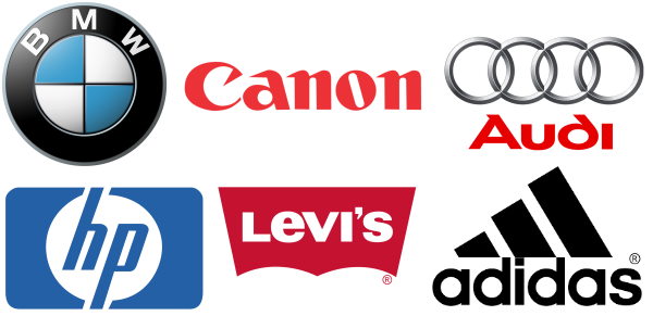
20. BMW
Using the Bavarian flag symbol, BMW is also effective as it sets out an example for the automobile world. Cool, ideal, perfect for a car brand.
21. Canon
This Japanese camera, printer, photocopier and other high-tech manufacturer adopted its current logo in 1956 and stayed unchanged ever since.
22. Audi
The four interlocking rings of the Audi symbol reflect the merger of four manufacturers of Auto Union.
23. HP
The lowercase monogram for Hewlett Packard is placed inside a solid circle. The blue color symbolizes professionalism and reliability.
24. Levi’s
In the middle of the 19th century Levi Strauss decided to sell gold diggers special clothes instead of mining gold himself. He patented buttoned, blue pants design in 1872 which makes it the oldest clothes brand in USA.
25. Adidas
The three strips represent a mountain, pointing right towards challenges and goals people need to overcome
Conclusion
A logo should be two things: memorable and revolutionary. If these two conditions are met, then your brand will thrive in no time. These criteria will separate you from your competition; it will foster loyalty and trustworthiness. So use your logo right!
Author Bio:
Susanna Balashova is a creative magician in a world of (mostly) boring Marketing. She turns dreary work things to be interesting and effective, as well as likes creating her own world within some fanfic sketches. She is one of the few professional essay writers so passionate about her work. Reach out to her on Twitter or LinkedIn.