Web design has faced a long way of formation and development and eventually turned into UX design. Now it’s the only form of websites’ existence, the central principles of which are based on users’ needs and usability.

User experience is the process of identifying users’ problems and solving them. Improvement in usability, ease-of-use, and satisfaction that the customer receives when interacting with a product determine the quality and relevance of this very product.
A UX designer makes sure that the product supplied by the company meets users’ needs and allows them to seamlessly achieve the desired result. Now it’s not enough just to work in Photoshop and be able to create layouts. A strong designer understands people’s needs and makes user-friendly interfaces.
UX trends
Before we start talking about how to improve user experience on your site, let’s take a look at the trends that affect both design and designers:

The simplification of the visual part of the interfaces
. A UX specialist no longer needs to spend a lot of time designing every button on your website and finding well-readable and understandable characters. The modern user easily understands the symbols. It’s no longer necessary to explain that a colored geometrical shape is a button, and three horizontal stripes or dots are a menu.
The complication of the design itself
The interfaces have been simplified, but the design itself has become more complicated. Today web resources are sophisticated systems with lots of various components: application forms, personal accounts, subscription forms, and online chats. It’s essential to consider a path users follow through your website interface to complete a task (quickly find the necessary sections, or, ideally, perform targeted actions).

The emergence of the UX designer
The market was flooded with multi-level narrow specialists with a UX / UI prefix. A cool UX designer understands the process and knows how to do both analytics and design well. But in reality, many people who know something about these terms and have at least a little deal with sites tend to call themselves a UX designer. In addition, various programs have appeared to facilitate the work of specialists and make the process of improving a website’s user experience much quicker (Adobe Solutions, Movavi Video Editor, Figma, Canva, and others). However, mastering such programs is only half the battle.
How to improve user experience on your website?
It’s important to understand that each project is unique. Therefore, there is no clear guide that you can simply follow and come to a great result. The secret to good conversion rates is the perfect UX design.

We have collected several ways to help you make a product attractive to your target audience.
Examine the needs
As trite as it may sound, you can’t launch a project without first studying your client’s needs. If a product is created without a clear plan and purpose, it’s doomed to failure in advance. Before starting, you need to understand whether there is demand and what solutions have already been implemented on the market.
Examining the needs of the target audience is the foundation of any project. It doesn’t matter for what tasks it’s created. You need to analyze your target audience and create customer portraits; determine your potential clients’ motivation and values to understand what can drive them to take the targeted action on the site.
Ease of use
User experience is a fragile thing that can suffer from any little detail. A digital product that is created to solve a company’s commercial problems must be perfect in all respects.

Newsletter subscription, online payment in the online store, purchase of shares, and other targeted actions are performed using all sorts of forms. A user enters an email into the subscription form or fills in the card details to make a payment. If it’s inconvenient, the potential client or subscriber won’t complete the targeted action. You will be completely at a loss.
Sticky Call-To-Action Button
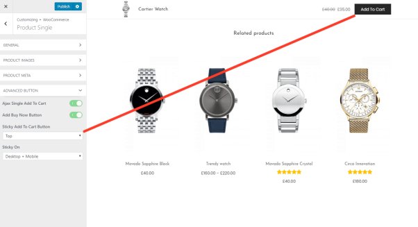
What is the most ideal result for a UX designer? That’s right, a made purchase, a completed registration, subscription, and everything else that is the main purpose. Now, the so-called sticky buttons are very popular. They are located at the top of the page when switching to a new one or refreshing the current one.
Quick purchase, subscription, signing up — all these are the very boosters of increasing conversion rates and improving your website’s user experience. Make such a button at the top of the page so that the users can immediately perform the targeted action, without wasting time looking for the information they need.

Online without registration
Don’t require registration from the users every time they visit the website. We all understand well that registration contributes to the personalization of the user experience. However, if you require registration while simply browsing your company’s blog, then you may not hope for a large number of users.
According to statistics, about 30% of visitors don’t return to the site if the sign-up form appears every time after refreshing the page. Provide your potential customers with the opportunity to visit the site as a guest, and leave certain functions only for registered users. If they like your resource or product, they will definitely sign up, and you will improve user experience of your website.
Make typos
Most visitors use the search function to find a product or section of your site that interests them. Therefore, it’s crucial to make the search convenient and place the search line in the visible part on each page.

It’s also worth considering that most users misspell, but this shouldn’t prevent them from getting the correct result. And here you need to be customer-oriented. Suggest possible options for what users are looking for. Display closely related words and inform clients that their request has been corrected. It’s simple, just like Google Chrome does it.
Save information
How often have you faced a situation when you filled out a large form or questionnaire, entered all the data, and then lost the Internet connection or all the entered data was deleted due to an incorrectly filled field? Happened, right?
Even if your forms are extremely simple, filling them out is still tedious. But if the text in the forms is erased due to a misspelling, this will completely discourage visitors from using your resource. Make sure that all information isn’t deleted by any typo made in the email address.
Show the right way
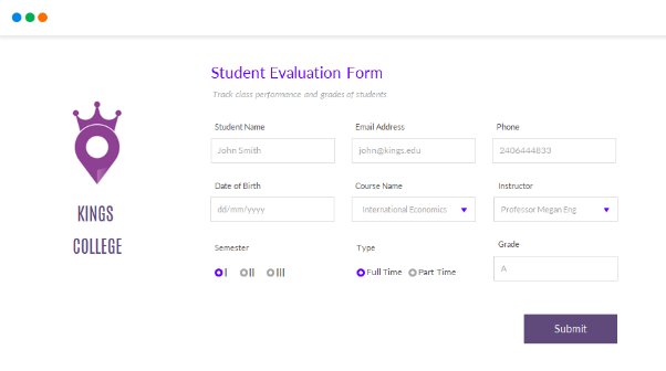
Show your visitors exactly what you want from them to improve your website’s user experience. To avoid misunderstandings and not lose potential customers, show how to fill out forms on your site. Explain to your users what you want them to do. In the blank field where they need to insert information, provide a clear example. After all, the same phone number and email address can be written in different ways.

Mobile website
More than half of Internet users prefer mobile devices for surfing the web. If your site isn’t mobile or tablet optimized, you’re missing out on a lot of traffic. A website that is fully optimized for a smartphone will help you to improve user experience. The website where you don’t need to enlarge the screen and try to understand what is written; where are convenient forms for ordering, registering, logging into an account, and so on.
Less is better
‘Less is better’ is definitely about UX design. Today, the readability of your text and the simplicity of the design are the most important factors keeping users on your site. The impression is created within the first seconds, so you have the minimum time to attract visitors.
Try to avoid using extremely unique fonts that might be unreadable. Instead, use a font and font size that is exactly eye-candy. To make your site stand out from the competitors, publish content that is easy to perceive. Use bullet points or a numbered list in your posts to provide easy-to-digest answers.
When you focus on the needs of people and help them solve problems as quickly as possible, commercial success is ensured. A good user experience is a good business. So, provide a great user experience for your website or application and receive the maximum benefits. Good luck!
