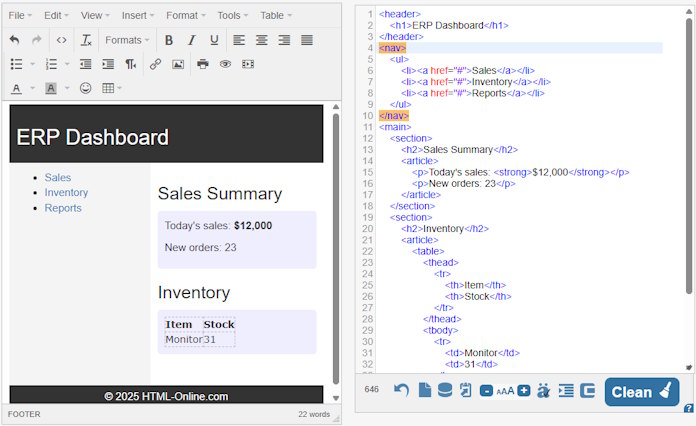
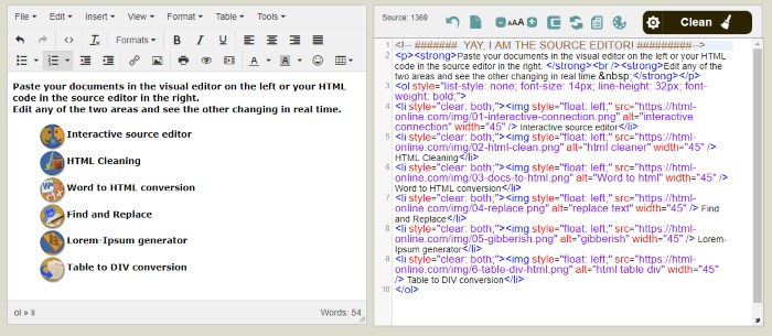
There’s a small kind of joy in opening a blank page and laying down the first tags. No build pipeline. No frameworks yelling for attention. Just you, the browser, and a handful of elements that have been around long enough to earn your trust. When I work this way, I think less about features and more about feeling. How fast does the page appear. How readable is the text. How obvious is the focus order. It’s quiet work, but it adds up. The online HTML editor is the perfect tool to build lightweight HTML code📝.
When my head gets noisy, I like to reset it with a tiny puzzle before I return to the markup. Lately that reset comes from a quick level on PuzzleFree.Game. It’s odd how a minute of sliding tiles or lining up colors can tune your eyes for structure. You come back and suddenly see the extra div, the awkward nesting, the style that should have been a class. Building for the web is a lot like solving small puzzles. The simpler the moves, the better the result.
Start With the Story of the Page
Every page tells a story. Sometimes it’s a product page, sometimes a tutorial, sometimes a single sentence that needs to be said out loud. Before code, I ask one thing: if this page were a small card handed to a stranger, what would it say in one line. That line becomes the <h1>. The supporting points become sections. You could call it information architecture, but it’s really just writing with structure. When the structure makes sense, you can style it any way you like and it remains honest.
Semantic Tags Are Tiny Accessibility Wins
<header>, <main>, <section>, <article>, <nav>, <footer>. These are not fancy. They’re the web’s original nice manners. Screen readers rely on them. Search engines understand them. Humans feel them. I have a test I run in my head while coding. If all styles vanished and the page turned into raw text, would I still understand the order and purpose of each part. If the answer is yes, I move on. If not, I shuffle the tags until the page “reads” even without decoration.
It’s tempting to drop a giant UI kit on a small page. But craft shows when you touch the CSS by hand. I reach first for system fonts. I accept the browser’s spacing and then nudge it. I keep color choices gentle and let contrast do most of the work. I avoid cleverness until I have a reason for it. The layout that looks simple but holds up at any width always beats the fancy one that collapses at 1024px. A single media query, well chosen, can feel like a magic trick.
@media screen and (max-width: 480px) {
}
JavaScript After Curiosity, Not Before
I sometimes write a page and ship it with zero JavaScript just to see how far HTML and CSS can go. Form validation can be gentle and native. Details and summary can open and close on their own. A checkbox can become a small state machine. When I finally reach for JavaScript, I try to earn it. Is it helping someone finish a task faster. Is it making the page kinder to keyboard users. If the answer is no, I wait. If the answer is yes, I keep the script short and the dependencies lighter than my morning coffee ☕︎

The List I Keep Beside The Editor
- Write the real title first, then the markup
- One <h1> per page and mean it
- Group content by meaning before thinking about layout
- Use native controls before custom ones
- Respect focus states and test with a keyboard
- Prefer system fonts and readable sizes
- Ship the smallest thing that solves the whole problem
Performance Is A Feeling
You can memorize metrics and shave milliseconds, but the moment that matters is when a reader clicks and the page is just there. You know the feeling. It’s the opposite of watching a loader spin. That feeling comes from a tight loop of small choices. Ship fewer images. Compress what you must. Inline what the browser needs to start. Let the rest stream in. When you treat performance as a feeling, you notice how heavy your choices are. You start leaving more on the cutting room floor, and your pages breathe.
A form can be an interrogation or a chat. Markup sets the tone. When you label each input, think of it as introducing a buddy. Tell them why you need the data, not simply what you want. Make mistakes that sound like aid, not alarms. Give groups names with <fieldset> and <legend>. Let the browser remember things. And always, always make submit buttons tell you what will happen. “Create account” is a promise. “Submit” is a shrug.
The Beauty of Defaults
Browsers give you so much for free. Default focus rings are visible and consistent. Default buttons have tactile clarity. Default inputs adapt to platforms. I used to fight these defaults in search of a brand look. Now I try to adopt them, then layer style with care. You can soften a focus ring without hiding it. You can make a button yours without making it a picture of a button. Defaults age well. Fads do not.

I love a good animation, but content wins every day. Write the headline until it sings at twelve words. Set the paragraph width so the eyes rest every line or two. Place images where they explain, not where they distract. The best decoration is the kind that helps the message stand taller. A hairline rule to separate ideas. A subtle shadow to hint at elevation. A contrast bump to guide the path. It’s like seasoning in cooking. Enough to unlock flavor, never enough to taste the salt itself.
Progressive Enhancement Is Quiet Bravery
Some people treat progressive enhancement like a backup plan. I think of it as a brave front line.
It says, “This page will work, and it will work better if your device and network allow it.”
It respects the reader you cannot see. It respects the train tunnel. It respects the old Android in a drawer that someone still uses to pay a bill. When you design from the core outward, you build pages that don’t break under pressure. They soften.
Tidy HTML Is Kindness To Your Future Self
I’ve never regretted deleting a wrapper or naming a class with a clear intent. I have regretted cleverness. Future you will thank present you for clean indentation, meaningful names, and <!–comments–> that describe why instead of what. It’s not about strict rules. It’s about leaving a trail that anyone can follow. Including you, six months from now, on a sleepy Tuesday with coffee gone cold.

Before I close the laptop, I run through a tiny ritual. I tab through the page once, eyes on the focus order. I zoom to two hundred percent and check if everything still breathes. I toggle dark mode if it exists and look for ghosts. I disconnect the network and reload to see what still shows up. It’s a quiet checklist, the kind that keeps bugs small and pages friendly.
Why This All Still Matters
The web is loud. New tools arrive every week with real value and real cost. When I need to, I utilize a lot of them. But at its foundation, the web is still papers, forms, and links that browsers strive to help with. Lightweight HTML isn’t a trip down memory lane. It’s about respecting the medium. Choosing speed, clarity, and access above spectacle is a choice. It’s not the only method to build, but it’s a manner I trust when I want to make something real that others can relate to.
Open a blank file and compose one true headline if you don’t know where to start. Add the words that must be said and nothing more. Mark them up with care. Style them with kindness. Ship it. Then iterate the way a puzzle solver does, one small correction at a time, until the page clicks into place and feels as light as it looks.