Design solutions are not always successful in terms of user experience. Sometimes fashion trends, which a few months ago enjoyed the effect of surprise, already now become irrelevant. This is because some solutions prove to be impractical during use.

It happens that the emergence of new technologies offers better solutions that compromise more recently popular trends. Sometimes design professionals get so carried away with non-standard and original ideas that they forget that they should be convenient and pleasant for users to use.
In this post, we will highlight trends that have proven to be ineffective in various areas of digital design. It’s about the visual aspect as well as the ease of use.
Spawning copies
Some experts don’t bother creating a unique look for the user interface. Many find solutions using standard images, illustrations, and other design solutions.
Others, in turn, do their job well, creating unique products. However, we see that copies of these works appear, which do not allow distinguishing the original from the fake idea. This in turn gives rise to similarity and, in some cases, identity to the original. In one area of activity, we can observe the same symbols, icons, and images, which do not help to increase brand awareness.
This trend is especially typical for banking. We see the same colors, illustrations, and other elements that are only slightly modified. In this regard, some works stand out, which are distinguished by their uniqueness. LS graphics offers unique solutions for creating exclusive design products that prove to be the most successful solution.
Strong contrast
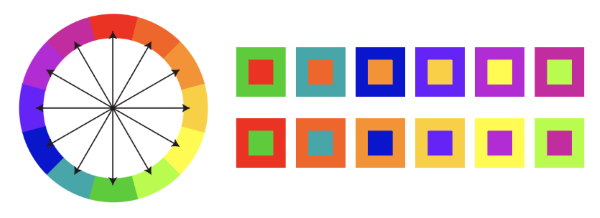
Vibrant color schemes such as neon or acid colors were once popular. They made it possible to stand out from the crowd. However, this trend did not remain in demand for long. Many designers and companies started using this solution, which led to a huge variety of similar ideas.

This has led to a large number of acid design ideas coming to the market. At one point, companies ceased to stand out due to this decision. On the contrary, they began to mix into one mess of bright colors that people quickly got tired of.
What we see is that massive use has resulted in visual clutter. Users refuse products because they look bright in the picture, but in fact, they have nothing in common with the picture in reality. This combination of circumstances leads to a huge amount of negativity and rejection.
Dark mode
The dark mode has always been in great demand. Its main need has arisen when using smartphones. The main advantage of this solution was the concern for users, their eyesight, and ease of viewing content.

However, now many experts have forgotten about its main purpose. We see a large number of websites, pages, and web resources emerge that offer exceptionally dark backgrounds without the ability to switch.
The dark mode remains relevant for viewing content on smartphones. However, the light mode is most preferable in situations for browsing the web on personal computers and in sunny weather conditions.
Dynamic solutions
In recent years, video content has been at the forefront of content and web page creation. Many companies rushed straight to creating videos and embedding them on landing pages.
We see the video become the title idea of every site. However, this caused web pages to take longer to load, which led to frustration on the part of users.
Designers and developers need to get the right idea of embedding videos on websites. The files should be in a convenient format and should load quickly. If there is text in the video, then it should be noticeable and easily readable.
Conclusion
Trends change regularly. Some design solutions remain exclusive and at the same time comfortable for the user experience. Other solutions quickly peak and also quickly lose demand.

Designers must not only pursue the side of uniqueness and dissimilarity but also remember that they are creating products for users that should be simple and easy to use.
